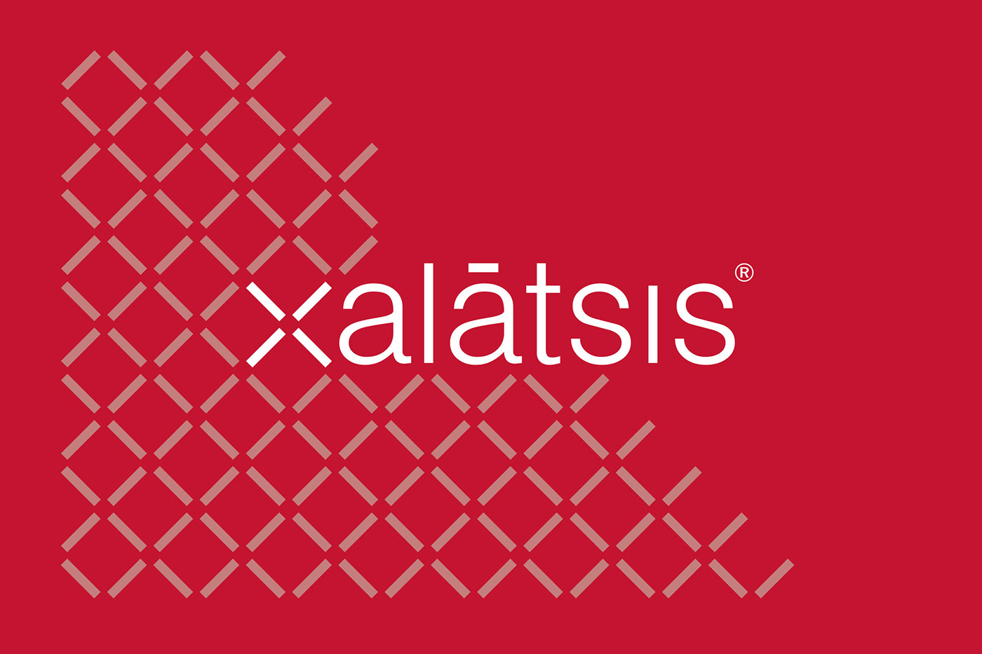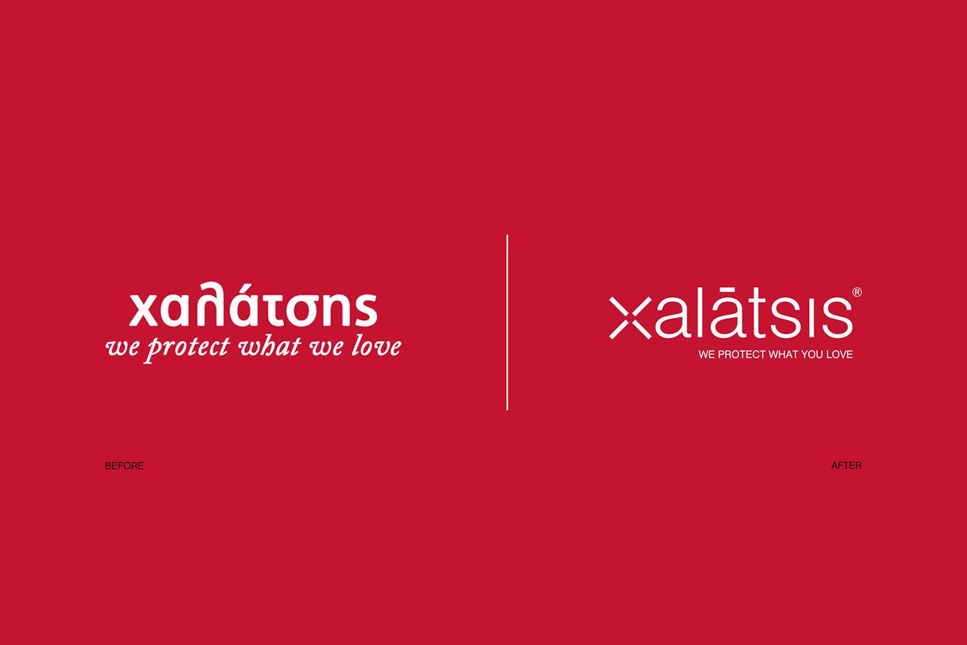
Rebranding for the safety-protection products and services company Xalatsis; based upon the modern principles of subtraction and underlined the most valuable asset of the business: the brand name.
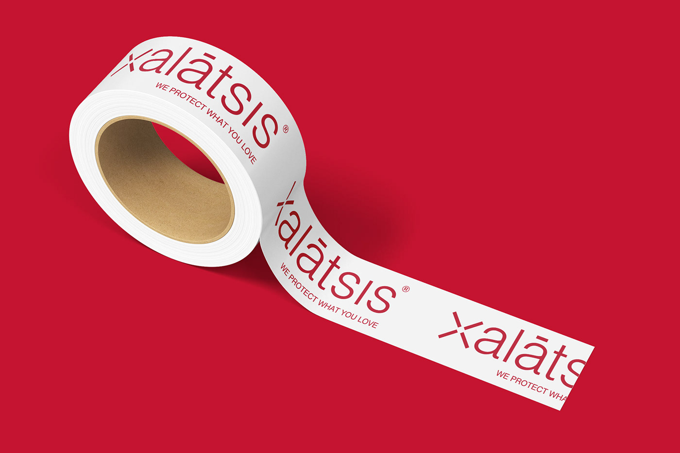
Located at the core of the project is the logotype, influenced by the outdoor environmental design of the main store, a pattern made by ‘’Xs” that embrace and protect its front side.
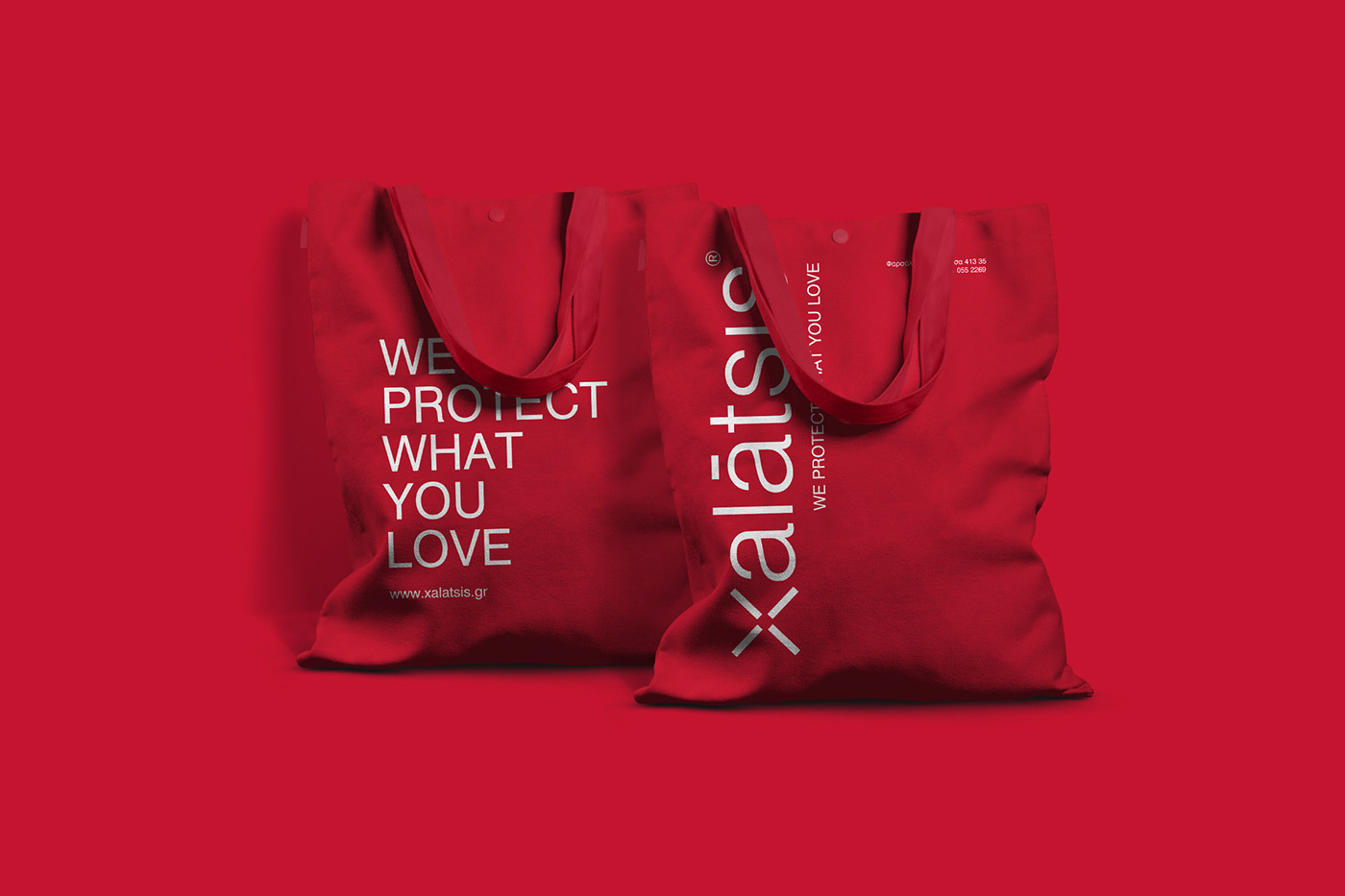
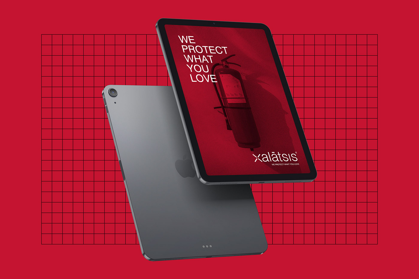
All around this core we developed a large number of corporate identity applications, using the color that mostly represents the basic product of the company: firefighting.
The slogan is all-pervasive: We protect what you love!